

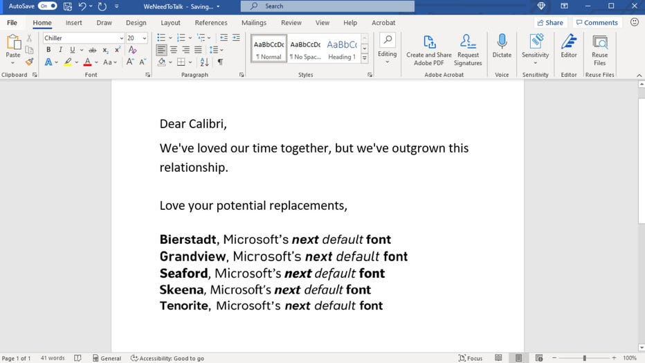
Microsoft wants your help choosing its next default font

Microsoft is retiring Calibri as its default font and is asking the public to vote on its successor.
The technology company has commissioned five new fonts, which are already available for use across Microsoft 360 apps. They’re inviting users to choose their favorite by leaving comments on social media.
"A default font is often the first impression we make; it’s the visual identity we present to other people via our resumes, documents, or emails," Microsoft said in a news release. "And just as people and the world around us age and grow, so too should our modes of expression."
Microsoft showcased its new default font candidates in a cheeky breakup letter to the Calibri font, which has been its default typeface since replacing Times New Romans in 2007. (Source: Microsoft)
Calibri has been the default font since 2007 when it replaced Times New Roman. Although it’s being retired, Microsoft said it’ll always be available.
"It has served us all well, but we believe it’s time to evolve," Microsoft said.
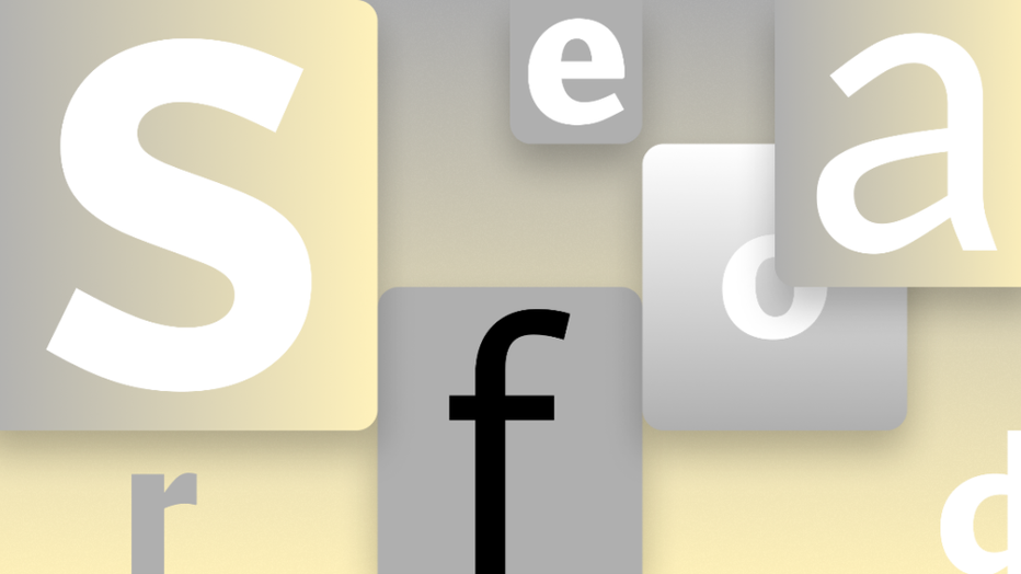
The new sans-serif candidates are Tenorite, Bierstadt, Skeena, Seaford and Grandview. Microsoft will be evaluating them over the next few months before choosing Calibri’s replacement.
Tenorite
Tenorite was designed by Erin McLaughlin and Wei Huang. (Source: Microsoft)
Tenorite, designed by Erin McLaughlin and Wei Huang, is designed with the overall look of a traditional sans serif typeface, but with a warmer, more friendly style, Microsoft said.
Its large dots, accents and punctuations are meant to make Tenorite a comfortable font to read on small screens.
"Tenorite’s punctuation was particularly fun to create, and we didn’t shy away from going large and circular," McLaughlin and Huang said. "In many typefaces, the punctuation is too faint, tightly spaced, or easily confusable for on-screen rendering, where clarity is key."
Bierstadt
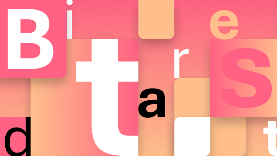
Steve Matteson created Bierstadt. (Source: Microsoft)
Steve Matteson created Bierstadt and said it’s based on the "grotesque sans serif" genre defined by block-style letters without calligraphic flourish.
It’s inspired by mid-20th century typography, popularized by Switzerland’s Helvetica font.
"Swiss typographers gravitated to grotesque designs like Helvetica because of their suitability for grid-based typography," Matteson explained. "In today’s world, I believe a grotesque typeface’s voice needs a bit of a human touch to feel more approachable and less institutional."
"Bierstadt’s systematic design contains organic touches to help humanize digital environments and soften the regimented order of grid typography," he added.
Skeena
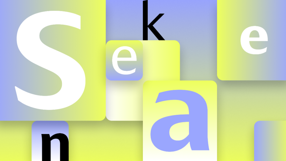
Skeena was designed by John Hudson and Paul Hanslow. (Source: Microsoft)
Skeena was designed by John Hudson and Paul Hanslow. Microsoft called it a "humanist" sans serif based on the shapes of traditional serif text typefaces.
"Because Microsoft wanted us to design for both text and display fonts, I decided we should use the latter to push the stroke contrast further. The display fonts, used at larger sizes, while clearly related to the text fonts, have a more dramatic impact," Hudson said.
Microsoft said Skeena is ideal for body text in long documents and shorter passages often found in brochures, reports, tables and other presentations.
Seaford
Tobias Frere-Jones, Nina Stössinger and Fred Shallcrass collaborated to craft Seaford. (Source: Microsoft)
Tobias Frere-Jones, Nina Stössinger and Fred Shallcrass collaborated to craft Seaford.
Microsoft said its gently organic and asymmetric forms help readers by placing emphasis on the differences between the letters, creating more recognizable word shapes.
"At the start, there was just a broad description of a personality—comfortable, warm, inviting, animated—so we began by studying the overall movement of old-style serifed faces. We hoped to create the same, familiar kind of warmth, but without the serifs," Frere-Jones explained.
Grandview

Grandview is a sans serif typeface created by Aaron Bell. (Source: Microsoft)
Grandview is a sans serif typeface created by Aaron Bell.
Derived from classic German road and railway signs — which were designed to be legible from afar — Grandview sports subtle adjustments for long-form reading.
Bell said he wasn't sure it was possible to craft a font that retained the spirit and personality of the German Industrial Standard (DIN). But he’s pleased with the way Grandview "preserves the voice of the original and works exceptionally well for long-form text settings."
"I’m excited to see how the community engages with it, particularly because the mechanical style of DIN is popular across a wide range of design implementations, from data visibility and gaming to document settings," Bell said. "I can’t wait!"
This story was reported from Atlanta.